
Looking Good in Print
Typography is the style and appearance of words on paper, computer screens, and other media. It has evolved from primitive drawings on cave walls in ancient times to stunning websites in the digital era. The elements of typography include alignment, color, consistency, contrast, hierarchy, and typeface. Good typography makes writing more effective just like good speaking makes oral arguments more persuasive.
Read on for tips to enhance the appearance of your correspondence, pleadings, and other legal documents.
Alignment. Enhance readability by aligning the left margin and using a jagged edge for the right margin. The first line of paragraphs should be indented to make each paragraph stand out.
Consultants. Consider hiring a design consultant to create a style manual and document templates for your firm. Use a consultant to format high-profile documents like appellate briefs, merger agreements, or stationery.
Drafts. Print drafts since documents can look different on paper than on computer screens. Review drafts for the appearance of text, fonts, and images. Consider asking other members of your firm to review documents before they are finalized.
Emphasis. Use italics and boldface to highlight ideas, but avoid overuse which is distracting. Do not use all caps or underlining because they overwhelm the text that surrounds them.
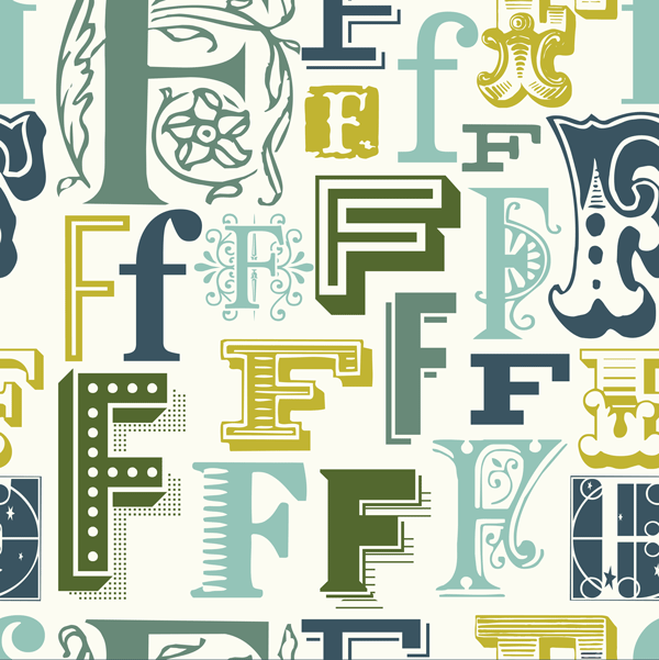
Fonts. Select 10 or 11-point fonts because they are easier on the eyes. Serif fonts like Times New Roman and Cambria are easier to read than sans serif fonts like Arial and Calibri. Serif fonts have “squiggles” that enable readers to distinguish different characters like i’s and l’s. They also hold the eye to a horizontal path making the text easier to read and less fatiguing.
Headings. Headings and subheadings provide visual appeal and enable readers to quickly determine the contents of each section of your document. Keep them short and simple.
Lists. Arrange points into lists to help readers organize their thoughts. Use bullets or numbers to convey related topics or show a hierarchy of importance.
Spacing. Avoid dense concentrations of text and image. Break text into as many paragraphs as possible with adequate paragraph spacing. Use empty space to make the text easier to read and give an uncluttered look. Achieve an appropriate amount of empty space with margins, lists, and space around graphics.
Table of contents. A table of contents helps readers navigate long documents. Both Microsoft Word and Apple Pages have tools that enable users to automate the creation of tables of contents
Resources. There are several resources online and in print to help lawyers and their staff. Visit websites for lawyers to learn about writing and typography. Read articles about briefs, fonts, formatting, pleadings, spacing, styling, tools, and techniques. Consult books about document design, formatting, style, writing, and typography. Adopt a law firm or bar association style manual to guide your staff on appropriate formatting.
Conclusion. Professional looking documents can help you win cases and clients. Lawyers and paralegals can enhance the design, format, layout of contracts, correspondence, and pleadings by using the formatting tips mentioned in this article and by reading the articles, books, and websites that are provided as additional resources.